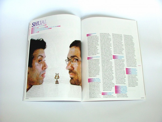
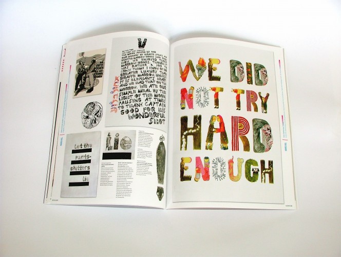
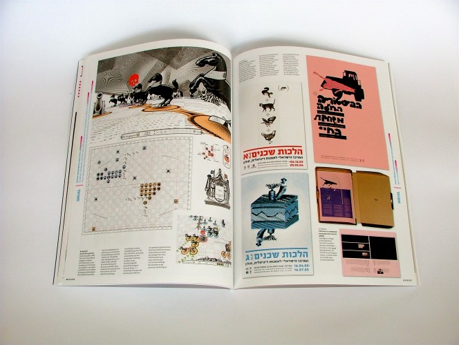
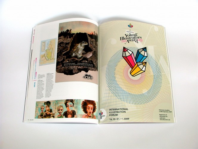
We were very honored to be interviewed by the pretty amazing French design magazine étapes for their 171 issue. étapes dedicated the issue to 8 studios and Shual was one of them. The 7 pages of interview featured some of our latest works and revolved around our practice, our aesthetics and the way we see how the occupation and our agency within it.
Here’s the beautiful magazine’s cover:

Etapes 171 Cover
And these are our interview spreads (click to enlarge):
We’re providing here the raw, unedited interview’s text as conducted in English.
Information :
When did you launch the studio (month, year) ?
September, 2002
Name(s), age(s) of the leader(s) :
Guy Saggee (40), Mushon Zer-Aviv (32)
Academic and professionnal background :
Guy – Bezalel Academy of Art & Design, Jerusalem (Bachelors degree in Graphic Design) + School of Visual Arts, New York (Masters degree in Illustration)
Mushon – Bezalel Academy of Art & Design, Jerusalem (Bachelors degree in Graphic Design) + Interactive Telecommunications Program, NYU, New York (Masters degree in New Media)
Both of us have been teaching in various collages and universities including: Shenkar – Tel Aviv, Bezalel – Jerusalem in Israel and Parsons and NYU in New York.
Staff : How many people ? What are the different jobs (functions) they have?
The studio size changes between 2-3 additional designers.
Questions :
What is the recent book (about image or graphic design) you could advise ?
Gary Panter issued an exceptional two volume anthology. He’s absolutely fresh and brave in the way he approaches again and again the empty page.Chris Ware’s Acme Novelty Library is a great source of inspiration and graphic innovation.
What are today the characteristics of the graphic design of your country ?
There is a great emphasis on typographic design in Israel today. It also makes Israeli design stands out as the (Hebrew) typography we use is unique. The modern and post-modern revival of the Hebrew Alphabet is probably one of the prettier sides of Zionist project. The academic level of Israeli design schools is very high, both on a visual and conceptual level. We regret to say web and interaction design are yet not as developed, but this is something we’re working to change.
Can you give us the name of 2 or 3 studios from your country that you specially like ?
Rather than studios, we would love to share the love with two amazing design collectives.
Hagilda (The Guild) – A type design collective founded by three of our most talented friends: Michal Sahar and Danny Meirav, Hatayas (and formerly also Oded Ezer).
Who (artist, designer, graphic designer, writer, philospoher Š) has influenced you and the way you work ?
Guy: I am constantly listening to music when I work. I feel it affects my works in so many ways i can’t quite define. One band that routinely plays in my speakers is Animal Collective (http://www.myanimalhome.net/). This NYC-based band has created a web of new compositional/improvisational strategies towards music that is at once very disciplined and then totally intuitive. I find it very inspiring for my way of thinking/conceptualizing design.
One quote from a designer / graphic designer or other about the graphic design / image :
“All buildings are predictions. All predictions are wrong.”
– How Buildings Learn by Stewart Brand
Your motto / or an advise for our readers ?
Do not be propagandists, not even in the service of so-called “good causes”. The best thing a design work can do is provide the healthy ground for an individual opinion to be constructed, while offering an additional perspective. Remember, the root of many of our world’s problem is simplistic thought.
Your own definition of the term ³ graphic designer² ?
Visual triple-agent.
In a few sentences, could you introduce us one of the typefaces you
enjoy(ed) to work with ?
Hebrew – Hadassah is a sort of Slab-Serif Hebrew font created by Henri Friedlander in the early part of the 20th century. (you can see it in use in our book designs – Block 5 &6)
Latin – Liberation Serif is a beautiful font which we used for both print and screen based design. It was released as an open-source font and is responsible for providing the Linux operating system with (better) alternatives to the proprietary Ariel, Times New Roman and Courier New.
In your opinion, what is now changing (or growing) in the graphic design sphere ?
Mushon:
Networked design. This is one of the biggest interests I currently have in design. While we were taught to shy away from the concept of “Design by committee”, every information-based market is being revolutionized by the new online sharing and collaboration tools. Having experience in the open source process with the development of projects like ShiftSpace, I think, for the sake of innovation and growth, designers have to learn to design together, in non-hierarchical collaborative environments, and in varied levels of contribution. There are good reasons why innovation in design collaboration is harder than in other fields, but I think we should be mindful of what works and what doesn’t and try to build better platforms for collaboration. I teach a class at Parsons in New York titled “Open Source Design” where we investigate these questions and the students work with and on open source software.
What are the strong point of studio shual- How did you describe your style ?
We do quite a lot of different work, but there are two main fields in which we probably have a unique approach. The first can be framed under the title “image making”, it is mainly led by Guy and his strong illustration background. The second is interaction design, mainly led by Mushon and his new media design background. We try to combine the two and sometimes make even our print design more open-ended and collaborative.
Did you think that your work has evolved since you started as a graphic designer ? Since you work together ? In what way ?
Guy:
After my design studies I did a big tour before getting back to “proper” graphic design. For a couple of years I was involved in performance art, then I co-founded the interactive group Eyescene. Only then I Re-found the will and the love for graphic design and typography. Mushon and I teeming up was a great way to share the passion for the new blooming graphic design field. It allowed us to work on projects diverse and complicated while still maintain our separate disciplines and approaches.
Mushon:
I started as an illustrator and comics artist, then in Bezalel rediscovered myself more as a graphic designer. Since starting Shual I became more and more interested in new media and have done a lot of webdesign. In my time in New York (4 years now) my work has evolved to explore interaction design and find the fundamental differences between webdesign and (social) application design. The technology for these might be similar, but the conceptualization and design patterns are quite different.
Our work together has changed us fundamentally. We are both stubbern people, and being Israeli we like to argue a lot. When we work on a project together we try to first discuss it, then come back with some ideas and sketches, then we argue like crazy trying to defend our ideas and pick the other’s idea apart, this usually leads to a new third direction that we could have never gotten to otherwise. Our best collaborative work has been developed in that way. It can be painful, but we enjoy every bit of it.
Do you have an ideal of design ? What is it ? – Do you think that graphic designers have a social goal? Which one ?
We don’t believe designers should have one shared ideal or goal, but there are some design approaches that can and should be challenged. Like the idea of who we serve. We tend to think that the client is whoever pays, but this is only a partial image. It is the recipient of the communicated message that would give it its legitimacy and power, and therefore the interests of the client (the job requester) are best served by a designer who is attentitive to the viewer/reader/user’s needs. This is a very clear lesson from interaction design. Apart from that, we do believe that people, if they are designers or not should act according to a set of beliefs – be sincere, especially if their work deals with people and involves shaping of ideas and perceptions. It’s not about a single goal, as much as it’s about responsibility.
What part of intuition / what part of reason ?
Intuition is a very strong element in our first steps in imagening a project. It is then re-examined and grounded in reason.
What is the starting point to begin each work ?
Conflict.
Did you work sometimes on personal projects ? Why ?
We both spend a lot of our time on what’s called “personal projects” or non-commercial work. We try to express and explore as much as we can within client work but it always has its limits. It is pretty healthy to have additional creative outlets. Moreover, these personal projects feed into client work too. The MoMA social-bar project is based both technically, conceptually, and to a certain degree visually on the ShiftSpace project. The You Are Not Here project got us a consultancy gig for a similar project in Amsterdam. The GIF dithering aesthetic we developed in personal project was later adopted to several different media – print, video, animation, game design, web – both for client and personal projects. On other occasions the personal projects will end up in galleries as with the Hunted Letters Series. Yet almost always it will retain a strong emphasis on graphic methods and formats. All these practices feed each other, we try not to draw a clear line between them as we find both enjoyable and challenging.
You work a lot about political topics : about Israel situation but also about war in the world. How do you get onto this kind of violent subject ? Do you use especially illustration to soften image or subject ?
War and occupation are a part of our life in Israel. We both served in the Israeli army for three years from the age of 18-21 and were called on reserve service for years after. National identity and the definition of borders are central to the “Israeli experience”, yet these borders are ever changing and are hard to follow. The national borders of Israel have never been officially defined – this creates many border conflicts, both in a security and diplomatic level, but also on a social, personal and psychological level. The subject comes up a lot in our work both because of our personal interest and through our work for the Israeli Center for Digital Art, one of our major clients which has a strong political focus (our studio is actually located within this art center).
Mushon: In the ‘Permanent Borders’ poster, designed for a critical posters exhibition around the Israeli independence day, I tried to recall my childhood memories of confusion dealing with different maps of Israel, each presenting different borders (48, 67, 79…). I was trying to imagine what my (future) daughter’s border experience might be, and I regret to say it will probably be similar. The image is drafted from borders and territories and the index lists the different territorial terms we grew up hearing around us. I find this absence of borders to be dangerous both for young children and for young societies.
Guy: In the ‘Haunted Letters Series’ the Israeli and Jewish subconscious unites to a looming black cloud hovering over the Israeli everyday life. I used narratives from Jewish history and drew them letter after letter into Latin and Hebrew alphabets. I used this new ‘type-faces’ in a series of posters which deals with the disturbed and fragmented lives we lead in this area of the world.
What do you love in Illustration media ?
Illustration is a very expresive medium, it is where both of us started and it is where we often enjoy going back to. We especially enjoy collaborating with illustration, we have different drawing styles, and in some of our works it is really fun to mash them together.
Do you think that you necessary to be engage as a graphic designer / Israeli graphic designer ? How can you react regarding the Violence you should see everyday in the medias ?
To be honest, the same way violence and war sells the newspaper, it also sells Israeli design. We try to avoid the cliche and the generalization that many Israeli creative practitioners are greeted with on the global stage. Filmmakers are expected to make films about waqr and occupation, musicians are expected to denounce the government’s policies as soon as they go on stage, artists and designers are expected to create work that would frame them outside of the political mainstream. Yes it is true, we are very politically engaged, and it is appearant in our professional work, but we hope this would be made a genuine choice of the designer, rather than an external expectation. Moreover, we do think as designers we should work from within our culture rather than be expected to criticize it from a “radical” and often marginalized perspective. Basically, to be able to overcome the extent to which war plays over our lives, designers and art practitioners should be able to picture a post-war Israeli culture.
Do you feel free to express everything that you think ? Concerning what you say and images you use ?
Yes. We do not experience any censurship when it comes to visual expression in Israel. There have been some journalism censurship during the recent crackdown on Gaza, but we cannot say it has affected our work. Basically the government is smart about maintaining the pluralism of cultural production sometimes acting as a vail to the less attractive sides of Israeli democracy.
I think That you use a lot of symbols in your images. There is also a lot of animals. Could you give some light about some of these one which are in my selection ? And explain me why do you appeal to them ? I question also the fact that Israel is a religious state and that¹s maybe refers to some symbolics language of Thorah, jewish culture and history.
It’s funny, I have never actually thought of it, and I probably should have, as the name of our studio “Shual” means fox in Hebrew. We definitely use a lot of symbols, some of them are indeed rooted in Israeli or Jewish culture. For example the first ‘Hilchot Shchenim’ (The Ways of Neighbors) poster is refering to a classic Israeli children story titled ‘Dira Lehaskir’ (Appartment for Rent) where the mouse leaves the top appartment and then the rest of the animals vet the other optional applicant animals for the vacant appartment. In the ‘High Command’ poster , the bear and the rabbit represent two past army generals Arik Sharon and Moshe Dayan and takes off of heroic representations of these two questionable figures in Israeli culture.
Your images are often weft marks like old engravings, is it just because you like this style?
First of all we sometime actually use these techniques literally in some of our works. For instant the ‘Let the pants shitters lie’ is a poster size etching. This style is put in the forefront in projects such as Kriegspiel, a board game invented by late French philosopher Guy Debord, which we (in collaboration with RSG) adopted to computer-game. The game is based on Napoleonic warfare and the engraved aesthetics was used to refer to that. In many works we often use our GIF dithering style, we like it because we find it is an interesting mashup of old vs. new technologies – early engraving / woodcutting vs. contemporary image compression algorithms.
Can you tell me about the technology you prefer use ?
We use the same technologies any other designer use, including the usual suspect Adobe product. However, we have an emphasis on the use of open source software. The fact the tools we use for front-end on the web (namely html/css, javascript) are open technologies is a huge game changers. We can learn from the work of our peers by picking at their code and learning their tricks. There are new initiatives to creating more open design environments for print-based design too, for example check out the collaborative book publishing tools developed by Floss Manuals. We’re pretty excited by the opportunities opened by these new tools, there is no doubt, this is the century of networked design, you’d better get your gear set.


